Refreshing your brand: How examining your identity can re-energise your event marketing
Written by Kevin Lawson, 29th August 2017
Things move fast in the events industry. No matter how great your branding looked when you started running your events, the chances are that after a few years it had started to look a little tired.
While it’s tempting to put off investing the time, money and energy in refreshing or redesigning your marketing materials, the painful truth is that if you don’t, it’s going to start costing you customers.
With that in mind, we posed some questions to Lynden Oliver, our Senior UI Designer, to talk in detail about how he went about creating the recent changes to the look and feel of the Ticket Arena and Event Genius brands.
EG: When you started with the redesign of the branding, what was the brief that the business provided you with?
Our objective was to create a flexible design language that promotes who we really are. Our brands Ticket Arena and Event Genius were disjointed and didn’t reflect our approach with our promoters, their events and ultimately the relationship with the fans. We were looking to bring these together so we had a flexible system where both brands could sit together and truly represent us.
EG: In response, what research did you do? Did you find inspiration from any unlikely sources?
We started with some internal workshops involving members from across the business, the aim was to dig into our team, culture, what we offer, where we were, and importantly where we wanted to be in the future. Off the back of these workshops our brand values were circulated so people could share their views before finalising, as they are the foundation of our brand, it was important that they were a true representation of our business.
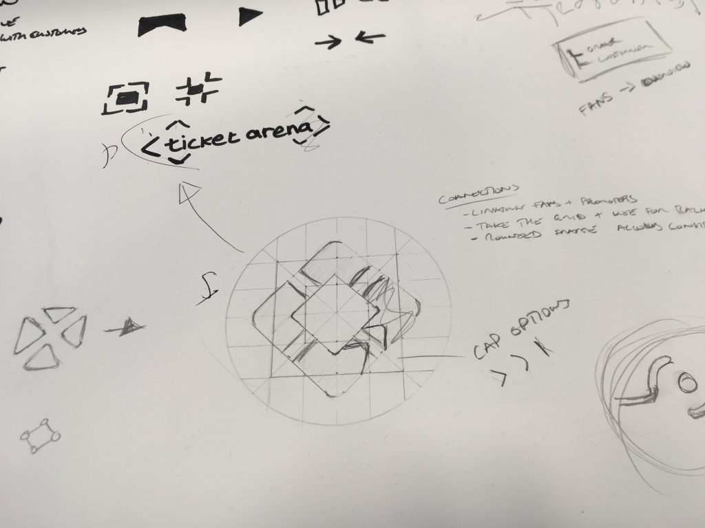
We looked at how our brands interacted and researched other organisations that have sub brands whilst maintaining the overall form for easy recognition. Some brands that stood out were the Premier league, FedEx, media outlets such as USA today, and potentials further afield that used dynamic logos from people such as MIT Media Labs and product branding like soft drinks. We spent a good amount of time researching shapes and symbols used across a range of industries and time periods for inspiration when looking for more abstract options.
EG: Was there anything about the old design that you wanted to keep, or maintain so that the changes could keep a sense of continuity? Or did you aim for a clean break with the past?
It was identified early on that we wanted to have a holistic representation of the lifecycle for events that could be shared across our brands, as we are about the whole experience; from the promoter initially setting up an event, us working with them to promote and sell tickets, getting fans into the event and then analysing data to help maintain that relationship. In order to do this, we felt that we needed to move in a more abstract representation for our logos so both brands could sit together seamlessly. The old Event Genius logo had an element of communication which is a key value for us and therefore an area we evolved during the ideation process to reflect that ongoing connection between promoters, fans and the experience of the event.
EG: How much of a challenge was it to create complimentary designs for business to business (Event Genius) and consumer facing (Ticket Arena) brands?
Our initial research identified that the two brands shared very similar values, we are a vibrant team that’s passionate about events, experienced, customer driven, dedicated, and personable. Based on this we focused on what differences should be reflected across our design language.
During the process, we played with ideas around how the brand mark could be shared across Event Genius and Ticket Arena with the potential for them being inverted or interlinking symbols. In the end, we went with the approach of a reflected symbol, as Event Genius represents the foundation of the event and Ticket Arena leads the fan into the event.
The key areas we chose to contrast were our colour palettes and imagery. We wanted Ticket Arena to reflect the exciting and passionate side of attending events so went with a vibrant red palette and selected imagery that is from the perspective of the fan. Event Genius uses an evolved palette that is energetic and adopts imagery from the perspective of the promoter.
Working with this concept allowed us to share the underlying design language and ultimately have vibrant brands that can sit together.
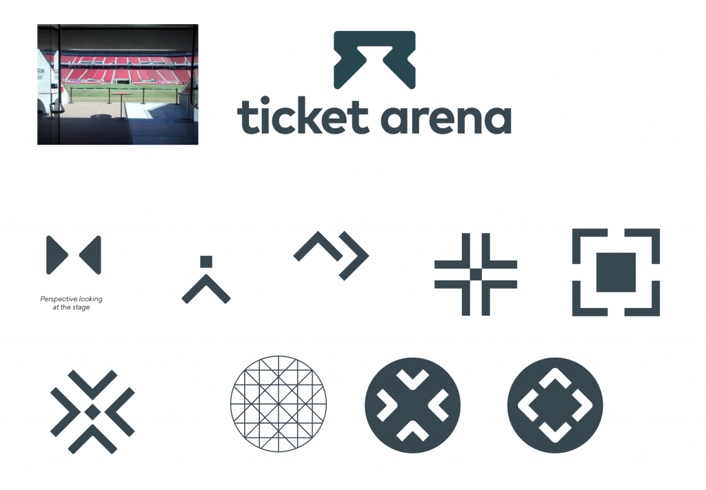
EG: With regards to the final designs, the brand guidelines and logos for Ticket Arena & Event Genius, could you describe how they relate to our business and services?
Our brand is about our team and services we offer, our design language represents this passion we have for events with the vibrant palettes, friendly typography and tone of voice, and the perspectives of the imagery we use.
We have created a design language that demonstrates our connection with both promoters and fans by bringing the experience of the event to the foreground, by doing this to the best of our ability, we aim to create a long-lasting relationship and ultimately a brand that can grow with that over time.
Categories
- All Blogs
- Best Practice (5)
- Company News (64)
- Current Openings (4)
- Event Genius Services (32)
- Event Industry News (29)
- In Depth (7)
- New Features (28)
- Training (1)